Website redesign conversations often begin with a visual complaint: the site looks old, the homepage feels crowded, the brand has changed, or a competitor’s website looks more modern.
Those observations can be valid. But they are not a diagnosis.
A redesign is a solution. Before deciding on the solution, you need to understand the problem well enough to know whether a redesign is actually the right response.
Otherwise, it is easy to spend weeks replacing layouts, colours and components while preserving the same confusing navigation, weak content, slow templates, broken measurement, inaccessible interactions or unclear customer journey underneath.
| A website can look completely different after a redesign and still have exactly the same problem. |
Start with the symptom, then keep asking what causes it
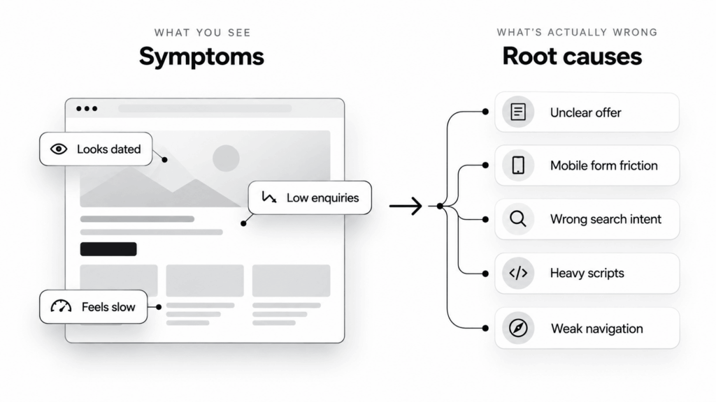
Suppose a service website is generating fewer enquiries than expected. ‘The website needs a redesign’ is one explanation, but it is only one of many.
The real issue could be that visitors do not understand the offer. The contact route may be buried. Mobile users may abandon a form. Important pages may attract the wrong search intent. The website may be slow on the devices customers actually use. Or the site may be working reasonably well and the traffic itself may simply be too low.
Those problems require very different responses.
Changing the interface before separating them is similar to replacing a dashboard warning light without checking the engine. It changes what you see without establishing what is happening.
A redesign should begin with evidence, not a mood board
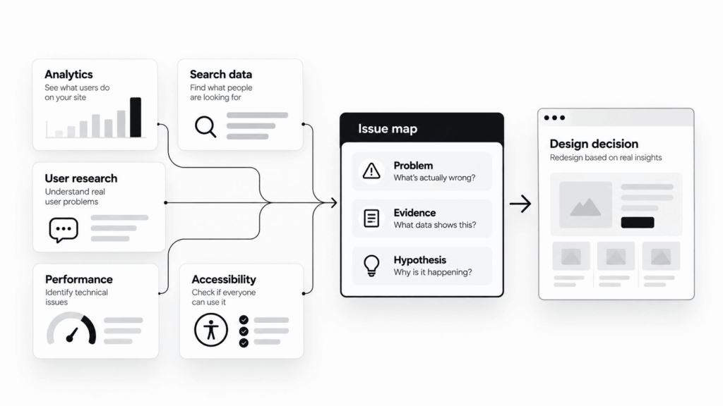
The first useful phase is not visual exploration. It is a short diagnostic exercise that combines several types of evidence.
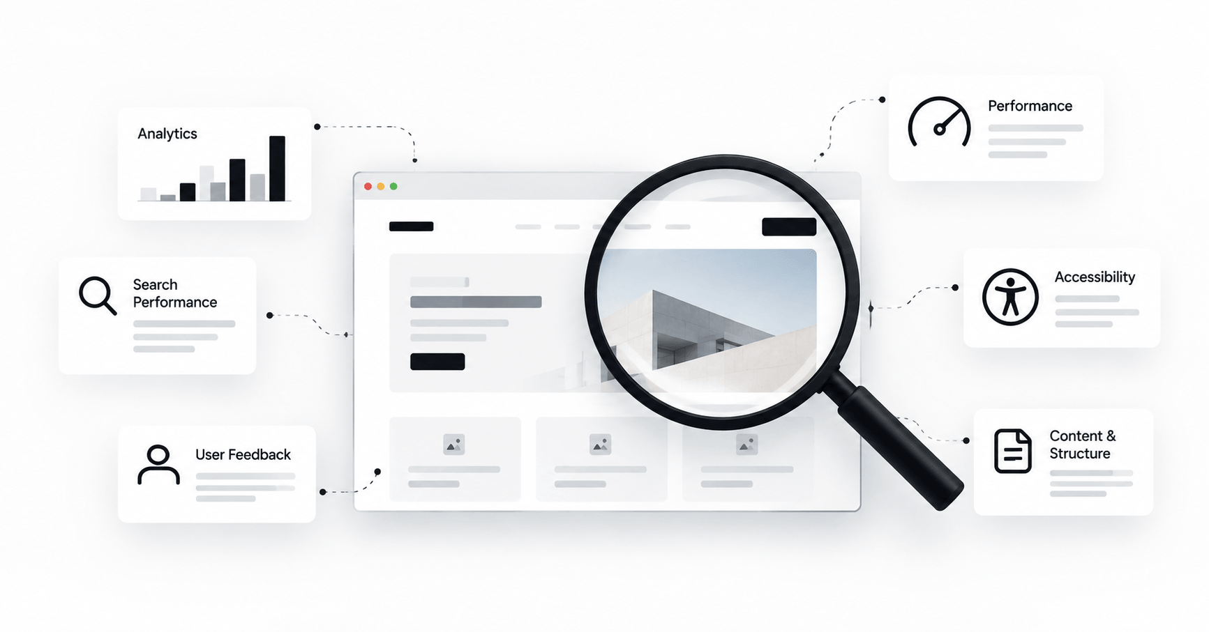
No single tool can explain a website on its own. Analytics can show where behaviour changes, but not always why. User interviews can reveal confusion, but a handful of comments should not be treated as population-level evidence. Lighthouse can identify technical opportunities, while real-user performance data can show whether people actually experience the same problems in the field.
The goal is to let different signals support, challenge or qualify each other.
1. Check whether the website is failing a business task
Before discussing colours, typography or components, define what the website is supposed to help people do.
- For a service business, that might be understanding the offer and making a qualified enquiry.
- For ecommerce, it may be finding a suitable product, trusting the purchase and completing checkout.
- For a course platform, it could be comparing programmes, understanding eligibility and enrolling.
- For a content site, it may be discovering useful information and moving naturally to related material.
Then compare the desired journey with what is actually happening. A redesign objective such as ‘make the site modern’ is difficult to evaluate. An objective such as ‘make it easier for mobile visitors to understand the service and reach the enquiry form’ gives the project something observable to improve.
2. Look at behaviour before guessing at behaviour
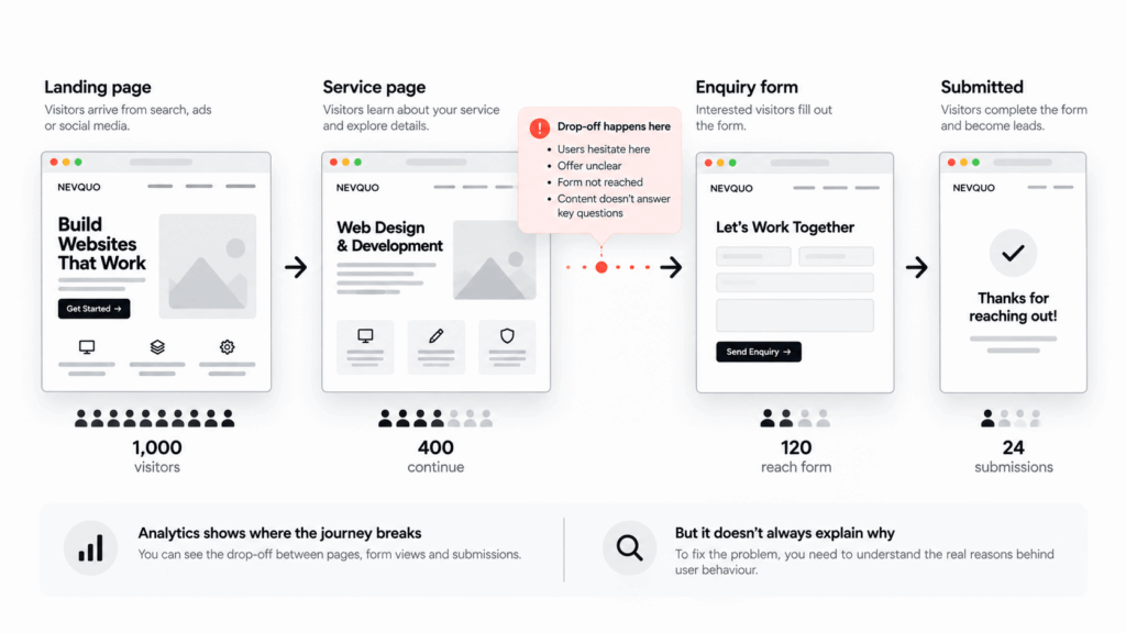
Google Analytics 4’s Pages and screens report shows which pages people visit and lets you focus on individual pages. That is useful for identifying where attention is concentrated and which parts of the site deserve closer investigation.
Analytics becomes more valuable when you use it to ask specific questions rather than stare at totals. Which landing pages start important journeys? Where do people stop? Are mobile and desktop behaviours materially different? Which pages receive traffic but rarely lead anywhere useful?
A high exit rate or a short visit is not automatically proof that a page is bad. Sometimes a visitor gets exactly what they need and leaves. The number becomes useful when it is interpreted in the context of the page’s job.
This is why measurement should generate questions, not automatic redesign decisions.
3. Check what people expected before they arrived
Search data can expose a different kind of mismatch.
Google Search Console can show the queries that surface a site, the pages receiving clicks, impressions, click-through rate and device differences. Its current Performance reports also support comparisons across periods and filters for pages, queries, countries and devices.
That can reveal problems that a visual redesign will not fix. A page may receive impressions for a topic it only partially answers. An important page may be visible but attract few clicks because its title or description does not match what people expect. A mobile audience may behave differently from desktop visitors.
Before rewriting page layouts, understand the relationship between what the page promises in search and what it delivers after the click.
4. Separate ‘the site feels slow’ from the actual performance problem
Performance deserves the same diagnostic discipline.
A single Lighthouse score is useful for identifying technical opportunities, but it is not a complete representation of how every visitor experiences the site. Google’s web.dev guidance distinguishes lab data from field data: lab tools test under controlled conditions, while field data reflects real users, devices and networks.
That distinction matters during a redesign. A prototype can be visually cleaner yet become slower once production fonts, tracking scripts, ecommerce extensions, videos, consent tools and third-party integrations are restored.
Establish the current baseline before rebuilding. Otherwise, the new site can be launched with no reliable way to prove that performance improved rather than merely changed.
5. Include accessibility in the diagnosis, not at the end
Accessibility problems are also easy to hide under a visual refresh.
W3C’s Web Accessibility Initiative recommends evaluating accessibility early and throughout a redesign. It also makes an important distinction: automated tools can help identify issues, but no tool alone can determine whether a website is accessible. Human evaluation remains necessary.
A useful pre-redesign review can therefore include basic keyboard navigation, visible focus, heading structure, text alternatives, colour contrast, form labels and error handling, followed by more comprehensive testing where appropriate.
This can change the redesign brief itself. What initially looked like a styling project may turn out to require changes to component behaviour, content structure or the underlying CMS.
6. Talk to users, especially when the numbers cannot explain the problem
Quantitative data is good at showing patterns. It is much weaker at explaining what someone thought a label meant, why they distrusted a page, or what information they expected to find before continuing.
This is where even a small amount of structured user research can be valuable.
The GOV.UK Service Manual frames discovery around understanding who users are, what they are trying to do, how they do it now and what problems or frustrations they experience before planning or building a solution. The principle applies well beyond government services: research the problem before committing to the interface.
Support conversations, sales questions, form feedback, search terms, usability sessions and recurring customer confusion can all contribute useful evidence when interpreted carefully.
Turn the evidence into an issue map
At this point, do not jump straight into wireframes. Convert findings into a simple issue map.
For each issue, record four things:
- What is happening — the observable symptom.
- What evidence supports it — analytics, research, technical testing, support data or several of these together.
- What might be causing it — clearly marked as a hypothesis until tested.
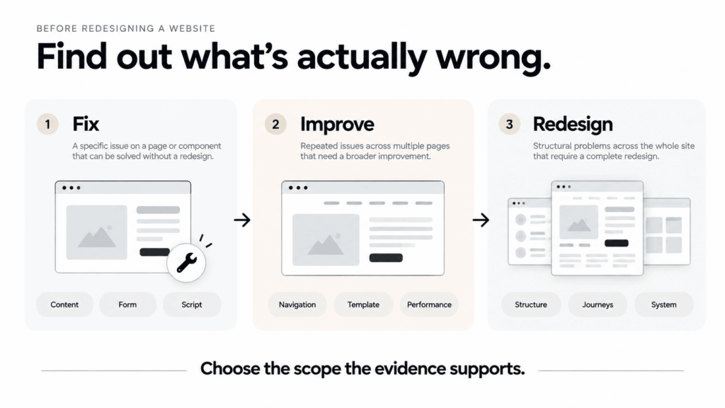
- What level of change it probably needs — content edit, component fix, template improvement, technical work, navigation change or broader redesign.
This step prevents every problem from being translated into ‘new page design’.
A confusing pricing section may need clearer content and hierarchy, not a new design system. A slow product archive might need query and frontend work. An inaccessible form may require component-level changes. A fragmented site with inconsistent templates, duplicated journeys and an inflexible underlying structure may genuinely justify a broader rebuild.
Preserve what already works
Redesign projects naturally focus attention on problems. That can create another risk: removing successful behaviour because it looks old or does not fit the new visual direction.
Before changing navigation, page structure or key calls to action, identify what currently performs well.
Which pages attract useful search traffic? Which journeys convert reliably? Which content answers common questions? Which interface patterns do returning users already understand?
Search Console is particularly useful here because it can identify pages and queries that already have visibility. Analytics and conversion data can show valuable journeys. User research can reveal familiar patterns people rely on.
A redesign should not require the existing website to prove that every element deserves to survive. But it should require a reason before removing something that evidence says is working.
Sometimes the right answer is not a redesign
A diagnosis may conclude that the website needs substantial structural change. That is a legitimate outcome.
But it may also show that the highest-value improvements are smaller:
- rewriting the first screen of an important landing page
- simplifying navigation labels
- fixing an unreliable mobile form
- improving a slow template
- removing unnecessary scripts
- clarifying product or service comparison
- repairing accessibility barriers
- improving measurement before making a larger decision
That is not a failed redesign project. It is a successful diagnosis that prevented unnecessary work.
Create a baseline before changing anything
If a larger redesign is justified, capture the current state before development begins.
The exact baseline depends on the site, but it might include search clicks and impressions, important conversion events, form completion, mobile behaviour, Core Web Vitals or other real-user performance data, accessibility findings, support issues and results from a few representative usability tasks.
The point is not to create a huge reporting exercise. It is to make the redesign testable.
After launch, you should be able to ask whether the specific problems identified during discovery improved. Without a baseline, teams are often left comparing screenshots and saying the new site feels better.
The redesign brief should describe problems before solutions
A strong brief can still include brand direction, technical constraints, content requirements and visual references. But its centre should be a set of clearly understood problems.
For example:
| Mobile visitors reach the service pages, but many do not understand the difference between the three offers or reach the enquiry step. User sessions also show that the current labels are interpreted inconsistently. |
That is much more useful than:
| Redesign the services page to look cleaner and more premium. |
The first statement gives designers and developers a problem to solve. The second mostly describes a preferred aesthetic.
A redesign should be the result of discovery, not the substitute for it
Websites accumulate problems over time. Content grows. Plugins and integrations are added. Business priorities change. Users arrive from new channels. Design systems become inconsistent. Technical decisions that were sensible three years ago can become constraints today.
A redesign can be exactly the right response to that accumulation.
But the value of the redesign does not come from changing everything. It comes from knowing what needs to change, why it needs to change, and what should be left alone.
Before opening a blank Figma file, find out what is actually wrong.
Recommended image placement
| Visual | Placement | Purpose | Suggested alt text |
| Thumbnail / Featured image | Featured image + top of post | Diagnostic-before-redesign concept: existing website under inspection, with evidence cards around it. | Website interface being analysed before a redesign decision |
| Visual 1 — Symptoms vs causes | After “Start with the symptom…” | Show visible complaints on the left and possible root causes underneath/behind them. | Diagram separating website redesign symptoms from possible root causes |
| Visual 2 — Evidence stack | After “A redesign should begin with evidence…” | Analytics, search data, user research, performance and accessibility inputs converging into an issue map. | Website audit evidence from analytics, search, user research, performance and accessibility |
| Visual 3 — Behaviour journey | After “Look at behaviour before guessing…” | A simple service-site journey with a visible drop-off point and diagnostic callout. | Website user journey showing a drop-off point before an enquiry |
| Visual 4 — Fix, improve or rebuild | After “Sometimes the right answer is not a redesign” | Three-column decision visual: targeted fix, template/system improvement, full redesign — based on scope of evidence. | Decision framework for choosing a website fix, improvement or full redesign |
Internal link suggestions
a website should feel simple → https://nevquo.com/good-websites-feel-simple/
website design and development → https://nevquo.com/services/
selected website work → https://nevquo.com/work/