Some of the easiest websites to use are surprisingly difficult to build.
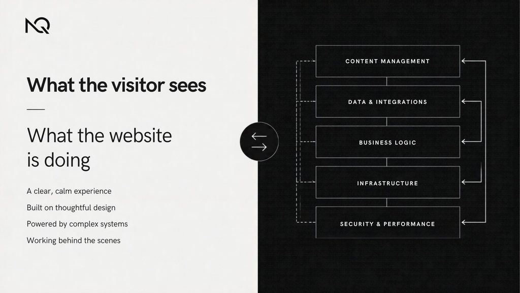
A visitor sees a clear heading, a few well-placed choices and an obvious next step. They don’t see the discussions about content structure, the responsive layouts, the edge cases in a form, the performance work, the accessibility decisions or the code connecting one system to another.
And they shouldn’t have to.
A good website doesn’t ask visitors to understand its complexity. It handles that complexity for them.
That is what makes simplicity difficult.
Simple doesn’t mean empty
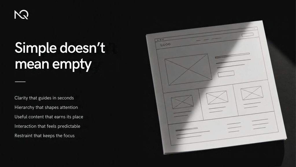
There’s a tendency to associate simple websites with minimal design.
Large type. Lots of white space. A short navigation menu. Perhaps very little content.
Those things can produce a clean interface, but they don’t automatically make a website simple to use.
A page can look minimal and still leave someone wondering:
Where do I go next?
What exactly does this company do?
Which option should I choose?
Did that form submit?
What happens after I click this button?
Simplicity is less about how little appears on the screen and more about how little unnecessary effort the interface asks from the person using it.
Research into cognitive load in interface design has made this distinction for years. Unnecessary choices, visual clutter and unfamiliar interactions all require additional mental effort from users.
Removing that effort takes more than removing elements.
It requires deciding what deserves to remain.
The user shouldn’t have to organise the website
Consider a service business with six different offerings.
One approach is to put all six services in the navigation, explain each one on the homepage and give every service the same visual importance.
Everything is technically available.
But now the visitor has to organise the information themselves.
A better approach might group related services, explain the main types of work first and reveal the details when they’re useful.
The amount of information hasn’t necessarily changed.
The structure has.
That’s an important part of good web design: deciding how information should be introduced, grouped and prioritised before worrying about how attractive the page looks.
A well-designed interface gives people a path through the information rather than presenting everything at once.
The simplest interface often has a lot happening underneath
Imagine an ecommerce checkout.
The customer might see:
Contact details
Delivery
Payment
Place order
Four straightforward steps.
Behind those steps the website may need to:
validate an address,
calculate tax,
check inventory,
apply a discount,
choose shipping methods,
communicate with a payment provider,
create an order,
send emails,
update another system,
handle failed payments,
and make the entire process work on a phone.
None of that complexity should make the customer feel as though they’re operating a complicated system.
The same principle applies to course websites, membership platforms, booking systems and ordinary business websites.
Technical complexity isn’t necessarily a problem.
Exposing unnecessary complexity to the user is.
Clarity starts before the visual design
It’s difficult to design a simple page when nobody has decided what the page is actually supposed to do.
Before choosing typography, layouts or animations, there are more basic questions:
What does the visitor need to understand here?
What are they likely to look for first?
What action matters most?
What information can wait?
What happens after that action?
Good visual hierarchy comes from having good answers to those questions.
If everything is important, the designer has no meaningful hierarchy to work with.
The result is often a page full of headings, buttons, cards and calls to action all competing for the same attention.
A cleaner design won’t solve unclear priorities.
The decisions have to come first.
Familiar isn’t automatically boring
Designers naturally want to make things distinctive.
That’s useful. Websites shouldn’t all look identical.
But originality becomes a problem when people have to learn how basic parts of the interface work.
A logo is normally expected to lead back home.
Navigation is expected to behave like navigation.
Buttons should look interactive.
Form fields need understandable labels.
A mobile menu should be easy to find.
These patterns are familiar because people have used them thousands of times.
That familiarity can reduce the amount of learning required to use a new site. Nielsen Norman Group’s usability guidance describes using existing mental models as one way to reduce unnecessary cognitive load.
Distinctive design works best when personality is added without making ordinary tasks mysterious.
You can create something recognisable without reinventing every interaction.
Performance is part of simplicity
A website can have a beautifully organised interface and still feel frustrating if it responds slowly.
Someone taps a button.
Nothing seems to happen.
They tap again.
The layout suddenly moves.
A large image appears late.
The menu hesitates before opening.
These are technical problems, but they’re experienced as UX problems.
Google’s web.dev performance guidance explicitly treats loading speed and responsiveness as part of the user experience, with Core Web Vitals measuring things such as loading, responsiveness and visual stability.
This is why performance decisions often start much earlier than optimisation.
A design that depends on huge videos, several font families, heavy animation libraries and many third-party scripts gives development a harder problem to solve.
Good performance is partly engineering.
It’s also restraint.
Responsive design involves decisions, not just breakpoints
Desktop layouts give designers space.
Mobile exposes priorities.
When there isn’t enough room for everything to sit next to everything else, decisions have to be made.
Which content appears first?
What happens to the navigation?
Should three columns become three stacked blocks, or should the information be reorganised?
Does a large comparison table still make sense?
Are tap targets comfortable?
Does an animation still help on a small screen?
A responsive website isn’t simply the desktop version squeezed into a narrower viewport.
Sometimes the content hierarchy itself needs to change.
That work is mostly invisible when it’s done properly.
The visitor simply sees a page that makes sense on the device they’re using.
Accessibility often improves the experience for everyone
Accessibility is another area where thoughtful work can make an interface feel simpler.
Clear labels.
Keyboard-accessible controls.
Visible focus states.
Readable contrast.
Predictable navigation.
Useful error messages.
Text alternatives for meaningful images.
These aren’t decorative additions.
They’re part of making an interface understandable and operable.
WCAG organises accessibility around four broad principles: content should be perceivable, operable, understandable and robust. Its guidance also notes that accessibility improvements often make web content more usable generally.
Accessibility is easiest to handle when it is considered while the interface is being designed and built, rather than attached at the end as a separate task.
More features can make a weaker website
When a website feels too simple, there can be a temptation to add something.
Another animation.
Another popup.
Another slider.
A chatbot.
A floating button.
A larger navigation menu.
More homepage sections.
Sometimes these features solve real problems.
Sometimes they’re just additional things competing for attention.
The useful question isn’t:
What else can we add?
It is:
What does this help the visitor do?
If there isn’t a good answer, the feature may not be improving the experience.
This applies to development too.
Installing another plugin can be faster than building custom functionality. Building something custom can sometimes be cleaner than forcing several plugins to work together.
Neither approach is automatically better.
The simplest result for the user may require a fairly complicated technical decision behind the scenes.
Good simplicity comes from removing uncertainty
When people talk about a website being easy to use, they’re often describing an absence of small moments of uncertainty.
They knew where to click.
The wording made sense.
The page responded when expected.
The form explained a mistake.
The mobile menu worked.
The payment completed.
The content answered their question.
They didn’t have to think about the interface itself.
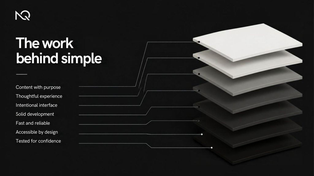
That experience isn’t created by one design trick.
It comes from many small decisions across content, UX, visual design and development working together.
The work should be visible in the result, not in the effort
A finished website may look straightforward.
That doesn’t mean the project behind it was.
There may have been dozens of decisions about what to remove, what to prioritise, what should happen on mobile, how something should behave when it fails, how quickly it loads and how different systems communicate.
Visitors don’t need to see any of that.
They need the result.
A clear page.
A predictable interaction.
A useful answer.
An obvious next step.
That’s why simplicity shouldn’t be measured by how little work went into a website.
Often, the opposite is true.
The website feels simple because somebody did the difficult work of deciding what the user shouldn’t have to think about.
Further reading
Nielsen Norman Group — Minimize Cognitive Load to Maximize Usability
Research and practical guidance around unnecessary mental effort in interface design.
Google web.dev — Web Performance
Guidance on loading performance, responsiveness, visual stability and their effect on the user experience.
W3C — Web Content Accessibility Guidelines (WCAG) 2.2
The current accessibility standard covering perceivable, operable, understandable and robust web experiences.