
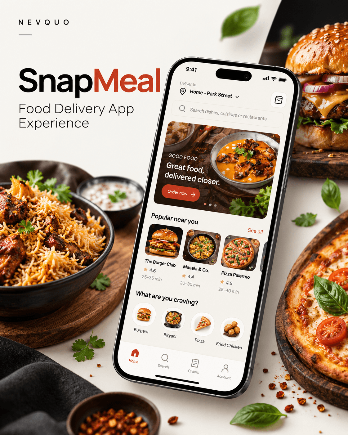
SnapMeal — Food Delivery App Experience
An independent concept for ordering food on a phone. We designed the screens and a small design system, then built them into a working prototype you can use further down this page.
Project context
There was no client brief. We wanted to see how much of a real ordering flow we could design and build ourselves, from finding a dish to watching it arrive.
What we wanted to explore
- One complete order journey, from search to tracking.
- A small design system that keeps every screen consistent.
- A prototype that can be used, not only looked at.
Main UX challenges
- Showing the same price on every screen.
- Letting people find food by dish, restaurant or mood.
- Making delivery cost clear before payment.
- Keeping the cart when the page is reloaded.
Constraints
- Only 22 supplied photographs, so menus only include dishes with a photo.
- Mobile first, a single-column layout.
- Front end only: no backend, real restaurants or real payments.
This project has not been tested with real customers. The decisions below come from design reasoning and from our own use of the prototype.
Design approach
The structure follows the order a customer would take. We designed each step with real content and linked the screens into one flow before turning them into the working app.
- 01SearchMatches dishes, restaurants and moods.
- 02RestaurantMenu tabs, offers and opening hours.
- 03ItemSize and add-ons update the price.
- 04CartFull bill, promo code, free-delivery progress.
- 05CheckoutDelivery note and an optional tip.
- 06PaymentUPI, card or cash on delivery.
- 07TrackingA live-style tracker with order status.
Design system
The tokens were set before any screen was drawn. The red-orange accent has one job: pointing at the next action.
Typography
Figtree in four weights. Icons are Lucide, used at a single stroke weight.
Colour
A warm off-white base, a near-black ink and one accent. Success and warning colours are for status only. Click a swatch to copy its value.
Spacing and shape
A 20px gutter on every screen. Corner radius grows with the size of the element.
Components
Buttons, chips, inputs and the veg / non-veg mark are reused across all screens. Try the button, chips and input.
Core screens
Eight of the screens, one at a time.
Home
A greeting, one featured photo and tiles to browse by mood. An Order again card appears once there is a past order.
Search results
Results by restaurant or dish, which can be sorted and filtered to vegetarian dishes.
Restaurant
Menu tabs, offers and opening hours in one place.
Item
Size and add-ons change the price before the dish goes in the cart.
Cart
The full bill, a promo code field and progress towards free delivery.
Checkout
Delivery note chips and an optional tip of ₹10, ₹20 or ₹30.
Tracking
The tracker moves through the order stages on a short timer.
Delivered
The order can be rated, then reordered.
Interactive prototype
The guided tour walks through one order, a screen at a time. The live app is the working build: add any dish, change quantities, try a promo code and place an order.
This is the real app running inside the page. Try the code WELCOME50 on an order of ₹249 or more.
Everything is stored in your own browser. Nothing is sent anywhere, and you can clear it at any time.
Photography
The app uses 22 photographs, one for each dish across six restaurants. Menus were built around the photos: a dish without one was removed instead of being filled with an illustration.
Key design decisions
Five choices that shaped how the app behaves.
One price on every screen
Item, cart, checkout, payment and confirmation all read from the same calculation, so the total cannot drift between screens. Taxes and fees are 5% of the item total, rounded up, plus ₹15. Delivery is ₹20 and free from ₹199. A promo code is applied before the total is shown.
Search that forgives
Search looks across dish names, restaurant names and moods, so “chicken biryani” and “comfort” both return something. The mood tiles on Home open the same results.
Delivery cost before checkout
The cart shows the delivery fee and how much more is needed for free delivery, so the cost is clear before the payment step and not on it.
The cart survives a reload
Cart, past orders, favourites and address are saved in the browser. Reloading the page returns to the same state.
Reordering
Home has an Order again card and each past order has a Reorder button that refills the cart, since many orders are repeats.
What was built
The prototype is a small working app, written without a framework.
- Content
- 6 restaurants and 22 dishes, each with a photograph.
- Screens
- 12 screens, from Home to order tracking and past orders.
- Ordering
- Cart, 2 promo codes, 3 payment methods (UPI, card, cash on delivery), tip and delivery note.
- Tech
- HTML, CSS and vanilla JavaScript. Photos and fonts are embedded. State is kept in the browser.
- Not included
- A backend, real restaurant data and real payments.
Next iteration
SnapMeal is a concept and has not been tested with real customers. This is what we would do next.
Usability testing
Ask people to complete an order and note where they hesitate, especially in search and checkout.
Accessibility review
Check contrast, focus order, screen reader labels and text scaling across every screen.
Real payments
Replace the demo payment step with a payment provider for UPI and card.
Restaurant side
Design how a restaurant manages its menu, receives orders and sets preparation times.